This blog is about painting and drawing. I post links to resources, tutorials, graphics software and interesting artist bloggers.


Friday

Photoshop Mega list from Fossfor's laboratory


Tutorials:
http://psd.tutsplus.com/category/tutorials/
http://www.emagzin.com/featured/photoshop-101-beginning-photoshop/
http://www.edesignerz.net/tutorials/photoshop
http://speckyboy.com/2010/02/22/a-round-up-of-50-fresh-photoshop-tutorials-and-techniques/
http://www.photoshopsupport.com/
http://www.psdvault.com/
http://www.smashingmagazine.com/tag/photoshop/
http://www.tipsquirrel.com/
http://www.photoshoproadmap.com/
http://www.tutorial9.net/category/photoshop/
http://tinyurl.com/33vpmjz
http://machoarts.com/17-best-photoshop-cs5-video-tutorials


Brushes:

http://www.brushking.eu/
http://dzineblog.com/2008/10/45-sites-to-download-photoshop-brushes.html
http://www.blendfu.com/
http://www.noupe.com/freebie/ultimate-collection-of-photoshop-brushes-actions-and-styles.html
http://josweb.co.uk/blog/2010/10/latest-free-high-res-photoshop-brushes-collection/
http://acrisdesign.com/2010/11/750-free-watercolor-photoshop-brushes/
http://www.photoshopsupport.com/tools/brushes.html
http://www.photoshopbrushes.com/
http://www.brushdirectory.com/


Patterns:
http://www.1stwebdesigner.com/resources/photoshop-patterns/
http://www.brushdirectory.com/patterns/

Shapes:
http://www.smashingmagazine.com/2008/12/11/the-ultimate-collection-of-photoshop-custom-shapes/

Gigantic list of tips from users:
http://blogs.adobe.com/photoshopdotcom/2010/10/photoshop-tips-from-photoshop-fans.html


An enormous list of Photoshop sites:
http://www.noupe.com/photoshop/the-ultimate-photoshop-toolbox.html


Or if you hate Photoshop and think it costs the earth try one of these instead!

Friday

Fosslab is on a break: follow me on Twitter

This blog is on an extended holiday. I seem to get a lot more feedback from Twitter where I post links on the same lines as here. There is so much useful info to be found there!

You can follow me as fossfor66 at http://twitter.com/fossfor66
My latest series of tweets is #coolartblogs
Hope to meet you all and get tweeting about art...


Wednesday

Silhouettes and Tangents

These two articles talk about a couple of important things to remember when you are designing characters or setting up enviroments and scenes.

Silhouettes:
'The reason silhouette value is important is because it's a great aid to "foolproofing" the clarity in your drawings - it helps make sure that everyone can tell exactly what your character is doing at all times.' This article is from a series titled ' a Kick in the head' on Mark Kennedy's wonderful blog Temple of the seven Golden Camels which is about drawing, storyboarding and animation.

Tangents:
'If silhouette is desirable, tangents are not. Tangents occur when lines or shapes begin to collide hap-hazardly, usually right on the contours they are describing.' Will Finn is a colleague of Mark's and writes about tangents and why to avoid them in this article on the Small Room. This is something most pro artists do instinctively but sometimes it gets overlooked.

Monday

Mark McDonnell's sketchbook

This video is related to my last post on watching people work: Mark McDonnell has a nice Youtube channel with videos of him sketching. I like this one where he shows one of his sketchbooks, with great animals and characters.


He says this sketchbook is a Cachet, earthbound recycled sketchbook , ISBN # 1-56152-416-6, and it's great paper that can take a bit of punishment with wet media. He draws with Prismacolor markers and pencils. The black is a Gelly-Roll pen.

Wednesday

Process: seeing how other people work


Work In Progress: is a great place for processes. They are also quite large so you can get a good look at how they are done
.

Slam Blogsma: this blog by Sam Bosma has loads of thumbnails and sketches and shows how he goes from these to digital colour and texturing in Photoshop.

The Unreachable Itch is a blog by illustrator Jonathan Burton. He also posts character sketches, sketches to line work and colour finals.

Monday

Wheel of Time - Lord of Chaos Painting by Greg Manchess

I loved watching this video. I'm not even a fan of the Wheel of Time series but it's amazing the way this guy paints!

Friday

The Art Center: get some advice from the experts

'The Art Center is a brand new place where Artists will share Ideas, Tips, and Tutorials. It will quickly grow both in content and artists from all the different art mediums. The Art Center will be a sister site to the Character Design blog'
This is a relatively new site but already has many fascinating posts full of advice about drawing and design written by pro artists. You can follow this blog on Twitter to be sure not to miss any great tidbits.tobyskybuckle_theropeship_photo_workinprogress

Wednesday

WE book illustration: Process

I had the basic idea for the composition in my head and then made some thumbnails in Photoshop to see what it could look like and chose the image on the left as it has better balance.


then I drew a large detailed sketch on paper with a blue col erase pencil and scanned it. It also got flipped along the way. I put the line art on the top layer set to Multiply, this allows you to preserve your line art and paint on a white layer underneath.


I often start off painting with the gradient tool set to Radial and use it to paint. This is a really fast way to get some colour down. For this piece I made selections of the cosmonaut, mountains, planet and sky and then made alphas or masks of each one on other layers for easier selecting and painting later on


Then I lay down the basics with a large round brush set at 75% opacity, when I'm more or less sure of my values I take the brush opacity down to 50% . I used to paint a lot with watercolors and use the same sort of technique here. I gradually use a smaller and smaller brush to do details


As a rule I'm not keen on using special brushes, here I just used a stippled brush shape for the stars and the airbrush for some texture on the planet. I also used various layers set to Screen and Overlay modes to get the halo around the planet.


For the visor on the helmet I made an alpha layer to use as a texture with the 'Lighting effects' filter to make the relection look more spherical as it was too flat. Then I flattened all the layers and noodled around a bit to get a more unified look.

Tuesday

Coolvibe: digital art to inspire you

bobby chiuBobby Chiu

There is a great collection of digital art on this site. I especially love the first pic by Bobby Chiu of cute beasties on a branch!

Imagine FX new issue out now


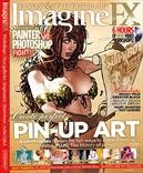
The latest Imagine FX mag has some good stuff this month.There's an article on how to make up a good portfolio, some interesting workshops including 'paint smarter, not harder' and another of their series of development sheets for game concept art.
An article titled' Photoshop vs Painter' takes on this endless argument, which I think is a futile one since they are both useful for different purposes. Anyway the contest ends in a draw here which makes sense. It is worth reading this article though if you are not familiar with one or either of the big P's, as they use 10 good examples to show how and when to choose Photoshop over Painter or vice versa.

Monday

3 Art podcasts not to miss

I am a podcast addict and recently came across some really good art pods via Twitter:
Escape from Illustration island podcast
Chris Oatley artcast
Art and story podcast

the guys who do these podcasts also have super sites so have a look at them while you listen to their pods.

Thursday

Art Rage 3 is here

I have been trying out the latest version of Art Rage for a few weeks now and am really pleased with it. I have the Studio Pro 3 version as it has the most features. They have improved the interface which was pretty good to start with anyway. Now you can scale the panels and also drop them on a second screen if you have one, to end up with an uncluttered workspace.
There is a 'canvas puck', a little navigator a bit like Photoshop has, but here you can use it to instantly rotate the canvas which is one of the most useful features of Art Rage.
New tools include Watercolors, the 'heavy bleed' setting gives realistic paint deposits, I was really surprised when I tried it out. They have also added Inking pens, and an auto smoothing setting on the pens and the pencil which means you can get that smooth vector-look similar to drawings done in Flash.
Other new stuff: the Gloop pen is good for trippy unexpected results and the Sticker pen which is like the image hose in Painter.
More really handy things are the Fill, Selection and Text tools and a straight-line function which do make life much easier even if they are not strictly drawing tools.
Anyway I definitely think Art Rage has grown up now, the Pro version is more expensive, but I think it's a match for some of the other big fat graphic apps out there!
link to comparison PDF

Tuesday

Imagine FX magazine #50

imagine fx 50
The 50th issue of ImagineFX magazine is a real smasher. On the DVD you get a demo of Manga Studio EX 4 that has no time limit, this alone is worth the cover price. There is also an article on Craig Mullins, just about the best digital painter ever, a sci-fi workshop with James Gurney and a list of the 50 best living artists. This is an interesting list but I don't agree with a lot of it, and why did they leave out Alan Lee??
I'm really chuffed because my beloved sweetheart has got me a subscription to this mag, so I shall be reviewing it a bit more often on this blog!

Wednesday

Mike Dutton One Swoop Fell video

One Swoop Fell is a fantastic webcomic made by Mike Dutton. It is one of the best webcomics out there by far, really well drawn with beautiful backgrounds. The story is poetic and sometimes dreamy but also funny and exciting. Something about it reminds of Miyazaki so I was not really surprised to read that he took part in the Totorro Forest Project
There is a film on Vimeo of Mike drawing an episode, I especially loved the inking part of this.

Thursday

Drawing with a brush in Flash MX

Bob Flynn is a cartoonist with a great blog called Drip. He writes about using Flash MX to paint and draw. His line work looks very clean but also really natural and hand drawn.
He starts by sketching in a lighter color and then inks making use of the onion skin feature. Flash is quite a fun app to draw with and using the same techniques in this post and quite a bit of patience you can achieve quite a natural line even though drawing with vectors. Read the articles here and here.

Wednesday

Comic tools blog

Comic tools is a great blog. This guy is very generous with his time and knowledge. Although the title is aimed at comickers this blog has loads of useful info for anyone who draws. I really like his anatomy tutorials, he has some really good tips and tricks for inventing characters and getting them to look right.

Friday

Brushes and Colors: digital sketchbooks

dragon by fossfor
There has been a bit of a buzz lately about Brushes, an app which turns your iPhone into a mini sketchpad. Apparently even David Hockney uses this! I have not tried Brushes but I do use Colors, another little app for the iPhone and Nintendo DS.
Colors is a great app, I use it on my DS lite with a chunky kid's stylus. One of the things that make it so great is that it takes advantage of the pressure sensitivity of the DS lite, just as if you were using a real Wacom or Cyntiq, but pocket sized. I'm not sure if Brushes has this feature but I don't think so.
To put Colors on your DS you have to buy a flash cart for homebrew apps. I use a R4 Revolution for DS. It is quite easy to set up, there is a good walkthrough on joystiq.

Brushes gallery

Colors gallery and my page